Choosing a colour for one room is fairly straightforward. Choosing colours for an entire home is a different challenge.
A successful whole-home colour scheme should feel connected without making every room look identical. Colours need to work with natural light, flooring, furniture, cabinetry, fabrics, artwork, and architectural details. Even the same paint colour can look surprisingly different from one room to another.
The good news is that you do not need to be a colour expert to create a cohesive interior. With a few simple principles, you can build a palette that feels intentional, comfortable, and personal.
What Is a Whole-Home Colour Scheme?
A whole-home colour scheme is a group of colours that work together across different rooms and living spaces.
This does not mean using the same paint colour on every wall. Instead, the colours should share some relationship, such as similar undertones, complementary shades, or a consistent level of warmth and intensity.
For example, a home might use:
- A warm neutral as its main background colour
- A deeper earthy shade for selected rooms
- A muted green or blue as an accent
- Natural wood tones throughout
- A consistent colour family in textiles and accessories
The result is a home where each room has its own character while still feeling like part of the same property.
Start With the Fixed Elements
Before choosing paint, look at the elements that are difficult or expensive to change.
These can include:
- Flooring
- Kitchen cabinets
- Worktops
- Tiles
- Brickwork
- Stone
- Built-in furniture
- Large pieces of furniture
- Architectural finishes
These features already contain colours and undertones that your paint needs to complement.
For example, a timber floor with warm golden tones may work naturally with warm whites, creams, beige, terracotta, and muted greens. A cool grey floor may sit more comfortably alongside cooler neutrals, blue-greens, or soft grey shades.
Paint should support these permanent features rather than forcing you to work against them.
Understand Warm and Cool Colours
One of the simplest ways to understand colour schemes is to think about temperature.
Warm colours generally include reds, oranges, yellows, warm beige tones, and some earthy greens. They can make rooms feel welcoming and intimate.
Cool colours include many blues, blue-greens, cool greys, and some blue-based neutrals. They can create a fresher and more spacious feeling.
However, colour temperature is not always obvious. A white can be warm or cool depending on its undertones.
This is why two colours that appear similar on a paint chart can look completely different once they are on a wall.
Pay Attention to Undertones
Undertones are subtle colours hidden beneath the main appearance of a paint shade.
A neutral may have yellow, pink, red, green, blue, or grey undertones. These become especially noticeable when the paint is placed beside flooring, furniture, tiles, or another paint colour.
If your flooring has strong warm undertones, a very cool grey wall may create an unwanted contrast. Similarly, a warm beige may look yellow against a cool white.
When choosing colours, compare samples with the materials already in your home rather than judging each colour in isolation.
Use the 60-30-10 Principle as a Starting Point
The 60-30-10 approach can help create visual balance.
A simplified version is:
- 60%: dominant colour, usually walls or large background surfaces
- 30%: secondary colour, such as furniture, cabinetry, or larger textiles
- 10%: accent colour, introduced through artwork, cushions, accessories, or smaller features
This is not a strict rule. Some interiors use a much more neutral palette, while others deliberately use stronger colour.
Think of it as a useful starting framework rather than a formula you must follow.
Decide How Many Colours a Room Needs
A room does not need a large number of colours to feel interesting.
In many interiors, two or three main colours are enough, with variations in tone and texture providing additional depth.
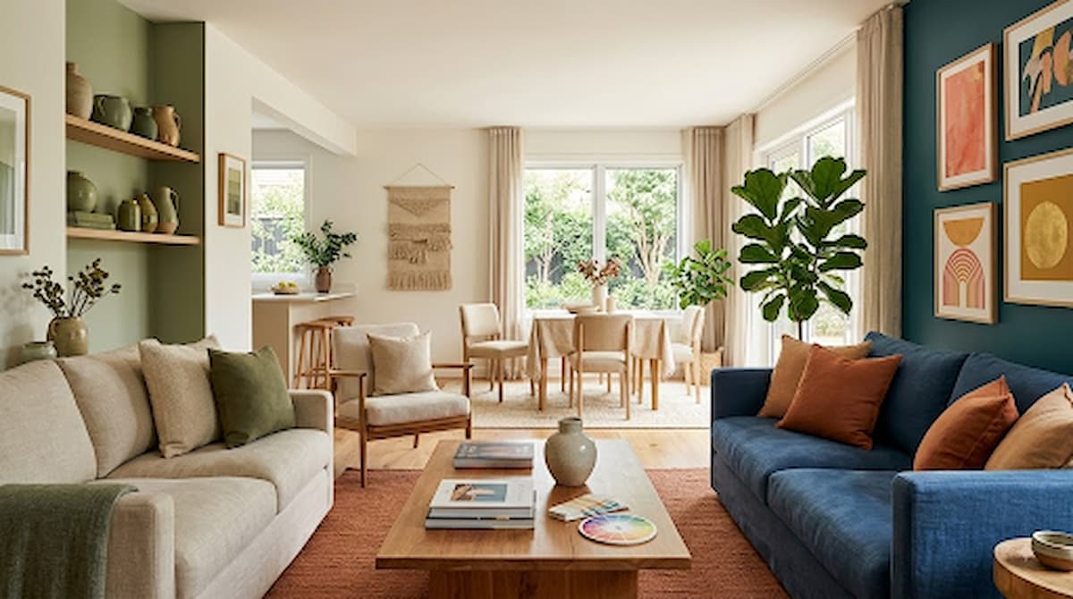
For instance, a living room might combine:
- Warm off-white walls
- Medium-toned wood furniture
- Deep olive green accents
You can then introduce interest through linen, wool, leather, ceramics, artwork, and plants without adding completely different colours.
Using fewer colours often makes a room feel more considered and sophisticated.
Create a Colour Flow Between Rooms
One of the best ways to connect a home is to repeat selected colours in different rooms.
A shade does not need to appear in exactly the same way everywhere. A muted green might appear as a kitchen cabinet colour, a bedroom cushion, and artwork in the living room.
Likewise, a warm neutral can continue through hallways and open-plan areas while individual rooms introduce different accent shades.
This creates continuity without sacrificing personality.
Should Every Room Use the Same Colour?
No. Every room does not need to use the same wall colour.
However, completely unrelated colour schemes can make a home feel disconnected, particularly when rooms are visible from one another.
A better approach is to create a shared foundation and then adjust the colour intensity according to each room.
For example:
- Bedroom: soft blue-green or muted neutral
- Living room: warm beige with earthy accents
- Kitchen: warm white with deeper cabinetry
- Dining room: richer, more dramatic version of the living room palette
- Hallway: light neutral that links the surrounding rooms
The individual colours can differ while maintaining a common visual language.
Consider Natural Light
Natural light has a major effect on how colour appears.
A bright south-facing room can make colours look lighter and warmer. A room with limited daylight may make some shades appear darker, cooler, or more muted.
The time of day matters too. A colour can look different in morning light, afternoon sunlight, and evening conditions.
This is why choosing paint solely from a small colour card can be risky.
Before committing, test large samples on the actual walls and observe them throughout the day.
Do Not Ignore Artificial Lighting
Artificial lighting can change a colour just as significantly as daylight.
Warm-toned bulbs can make some colours appear more golden or yellow, while cooler lighting can make them look sharper or bluer.
Check paint samples under the lighting you actually use in the evening. This is particularly important in bedrooms, dining rooms, and living rooms where artificial lighting plays a major role after sunset.
If possible, test colours near different light sources rather than in only one corner of the room.
Why Does Paint Look Different After Installation?
This is a common source of disappointment.
Paint can look different after application because of several factors, including:
- Natural daylight
- Artificial lighting
- Wall texture
- Surrounding colours
- Flooring
- Furniture
- Room size
- Paint finish
- Time of day
A small sample may also appear more intense when a colour covers a large wall.
For this reason, always test your preferred shades in the actual space before painting the entire room.
Build a Calming Bedroom Palette
Bedrooms generally benefit from colours that feel restful rather than overly stimulating.
Soft greens, muted blues, warm neutrals, dusty tones, and gentle earthy shades can create a relaxed foundation.
You can then add depth through bedding, curtains, rugs, and upholstered furniture.
If you want a darker bedroom, consider using a rich colour across walls and joinery rather than introducing several unrelated dark shades. A consistent deeper palette can feel sophisticated and enveloping.
Create an Energetic Kitchen
Kitchens can accommodate stronger colour because they are often active social spaces.
Cabinetry provides an excellent opportunity to introduce colour. Deep green, navy, muted blue, charcoal, or warm earthy shades can create a distinctive look.
If the cabinets are colourful, keep other major surfaces relatively restrained. This prevents the kitchen from becoming visually overwhelming.
Natural timber, stone, metal finishes, and simple textiles can provide contrast without competing with the main colour.
Give the Living Room a Sophisticated Feel
Living rooms often need to accommodate several activities, so a balanced palette works well.
Start with a comfortable background shade and build depth using furniture, curtains, rugs, artwork, and accessories.
Layering different shades of the same colour family can create a sophisticated appearance without making the room feel overly coordinated.
For example, a neutral room could include cream, taupe, warm brown, muted green, and natural timber.
Colour Schemes for Compact Apartments
Small homes benefit from visual continuity.
Using related colours across connected rooms can make the space feel larger because the eye moves naturally from one area to another.
Light and medium neutrals can provide a flexible foundation. Stronger colours can then be introduced through furniture, artwork, cabinetry, rugs, and accessories.
However, small spaces do not have to be completely white. A carefully chosen darker shade can create depth and character when used intentionally.
Creating a Luxury Interior With Colour
Luxury does not depend on expensive paint colours. It is often created through restraint, proportion, texture, and consistency.
Consider combining:
- Warm neutrals
- Deep accent shades
- Natural stone
- Rich timber
- Soft upholstery
- Metal details
- Carefully selected artwork
Rather than introducing many colours, choose a limited palette and vary the depth and texture within it.
A sophisticated interior often feels calm because nothing appears accidental.
Use Furniture and Textiles to Refine the Palette
Paint is only one part of an interior colour scheme.
Furniture, curtains, cushions, rugs, bedding, artwork, and decorative objects can introduce colour in ways that are easier to change later.
This is particularly useful if you are unsure about committing to a strong wall colour.
For example, keep the walls neutral and introduce a deep rust, forest green, or navy through an armchair, rug, artwork, or cushions.
If your tastes change, these smaller elements are much easier to replace than painted walls or fitted cabinetry.
How to Choose an Accent Colour
An accent colour should have a purpose.
Instead of selecting a bright colour simply because it stands out, look for a shade that already relates to something in the room.
An accent might pick up a colour from:
- Artwork
- A rug
- Natural stone
- Upholstery
- Curtains
- Timber
- Architectural details
Repeating the accent in two or three places usually feels more intentional than using it once.
Common Colour Scheme Mistakes
Choosing Paint Before Considering Flooring
Paint should work with the floor, not compete with it. Always consider fixed finishes before making your final choice.
Using Too Many Accent Colours
Several strong accent colours can make a room feel chaotic. Select one dominant accent and use smaller variations where appropriate.
Ignoring Undertones
A neutral that looks perfect on a sample card may clash with existing finishes once it is on the wall.
Forgetting Adjacent Rooms
Colours should be considered in relation to spaces that can be seen from one another.
Testing Only Under One Type of Light
A colour that looks attractive in bright daylight may appear very different under evening lighting.
Making Everything Match
A coordinated home does not need matching furniture, walls, and accessories. Variation creates personality.
Choosing Trends Over Longevity
Trendy colours can be fun, but your main palette should reflect the way you want the home to feel over time.
A Simple Process for Choosing Your Home’s Colour Palette
If you are starting from scratch, use this process:
- Identify fixed colours. Look at flooring, cabinets, tiles, stone, and large furniture.
- Decide on the overall mood. Consider whether you want warm, cool, relaxed, dramatic, bright, or earthy interiors.
- Choose a dominant neutral. This can provide continuity across several spaces.
- Select two or three supporting colours. Choose shades that work with the dominant colour and fixed finishes.
- Assign colours to rooms. Give each space its own character while keeping some colours consistent.
- Test large samples. View them in both daylight and artificial light.
- Introduce texture. Use rugs, fabrics, wood, stone, and artwork to add depth.
- Review the whole home. Look at connected rooms together rather than judging each room separately.
Frequently Asked Questions
Should all rooms in a house be the same colour?
No. Rooms can have different colours while still feeling connected. Repeating a few shades, using compatible undertones, or maintaining a consistent level of warmth can create cohesion.
How many colours should a room have?
There is no fixed number, but two or three main colours often provide a good foundation. Texture and variations in tone can add interest without introducing many unrelated colours.
What is the best colour for a whole house?
There is no universal best colour. Warm whites, soft greys, beige, taupe, and other versatile neutrals are popular because they work with many interior styles, but the right choice depends on lighting and existing finishes.
Should walls match the furniture?
Not necessarily. Walls should complement furniture rather than match it exactly. A contrast in tone or colour can make furniture stand out and give the room more depth.
Why does my paint colour look different in every room?
Lighting, room orientation, surrounding colours, flooring, wall texture, and artificial bulbs can all influence how paint appears. The same colour can therefore look warmer, cooler, lighter, or darker in different spaces.
Conclusion
A successful interior colour scheme is not about finding one perfect paint colour. It is about understanding how colours interact with light, materials, furniture, and the rooms around them.
Start with the fixed elements in your home, identify the mood you want to create, and build a palette around compatible undertones. Use repeated colours to create flow, while allowing individual rooms to develop their own identity.
Most importantly, test your choices before committing. Colours can change dramatically under different lighting conditions and beside different materials.
With a thoughtful palette, even very different rooms can feel connected. The result is a home that looks cohesive, feels comfortable, and reflects your personal style rather than following a rigid set of decorating rules.